I’ve been in the photography industry for almost 8 years now and let me tell you I’ve had my fair share of terrible websites. It’s something I love teaching because adding things (or taking away things) from your website is SUCH an easy and quick fix that can make a huge impact on your brand.
Most people aren’t directly searching your business name. So likely their first introduction to your brand is through social media or Google search. The next step however is almost always going to be to your website, let’s make sure it’s optimized and ready for that visit.
Today we are going to talk about the top 5 things you should do to your website to convert more clients and have more visitors hitting that inquiry button.
1. Get Personal
There needs to be a photo of your face somewhere! Looking at the camera and preferably on a couple of pages of your website. I can’t even tell you how many times I’ve visited a website and been curious about the person behind the brand and there’s NO PHOTO! We live in a connected economy and consumers want to know more about the brand they are looking at. Is this a real person, what do they look like?
2. Make Sure It’s Not Overwhelming
A long time ago I heard of the Grandma test. Simply put, if you showed this website to your parents or grandparents, would they be able to understand how to find everything? Is it clear how to get in contact with you, or is it complicated to find? Is your website filled to the brim with stuff and confusing? If someone who’s not tech-savvy and doesn’t work in the online space visits your website, then you have to make sure that it’s crystal clear to them how to access everything you want them to.
3. Your About Page Isn’t Actually About You
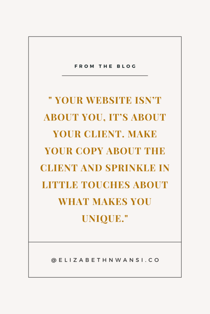
I know it seems really counterintuitive and here’s what I recommend. You’re about page should be WHAT IT IS about you that makes you the best match to serve the client. Going on and on about being a poodle lover and how much you love coffee and long walks on the beach is missing the point. You’re About Page isn’t about you, it’s about your client. Make your copy about the client and sprinkle in little touches about what makes you unique.

4. Your Header Needs to Be Concise
This is the FIRST thing that people see when they visit your website. How can you use it in a way to show people they are exactly where they need to be? Also, as a photographer, how can you use it in a way that allows you to rank with SEO in your area? When you visit my photography page you see “San Francisco Bay Area Wedding Photographer”. It’s to the point, it’s keyword rich and it lets people know exactly what they are getting on my website.
5. Add Your Starting Price (NOT YOUR FULL PRICE LIST!!)
When you put your full pricing out on display, you give the prospective client no reason to get in contact with you. Why should they if they can browse everything they need on your website?
Now I’m a big fan of transparency. So I recommend including your starting price so that people know right away if you are in their price range or not. With that being said, this really weeds out people who will say you are out of their budget but don’t give so much information that they have no need to inquire with you. Remember, by asking questions during your Consultation Call and getting to know more about your client’s needs, you can really give them accurate pricing information specific to their day.
Super simple and quick tweaks you can make to your website to have it converting better today. Let me know below which really resonated with you.

1. Free Masterclass: 4 Secrets To Booked Out With Luxury Weddings
3. Quarterly Marketing Calendar


Comments +